Your garden pathway is more than just a functional element—it’s an artistic opportunity to guide, inspire, and transform your outdoor space. With thoughtful color application, you’ll create pathways that don’t merely connect areas but enhance your entire garden experience. The right color combinations can direct movement, set moods, and highlight seasonal beauty. Ready to transform your garden paths from practical necessities into stunning design features? These ten color theory tips will show you how.
Understanding Complementary Colors for Visual Impact
When designing garden pathways with visual impact in mind, understanding complementary colors becomes essential to creating dynamic spaces that draw the eye and evoke emotional responses.
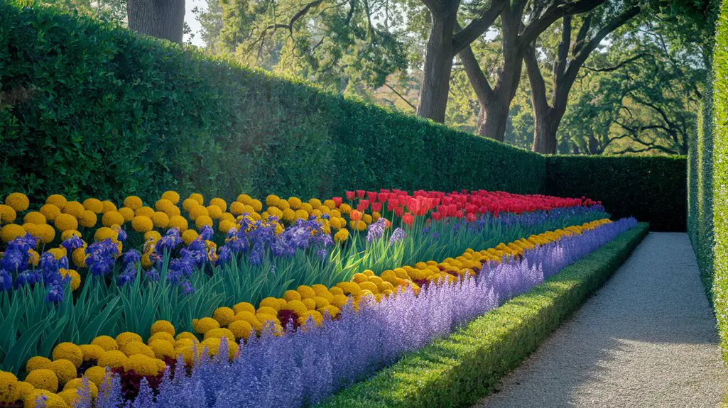
These color pairs sit opposite each other on the color wheel—purple and yellow, blue and orange, red and green—and create vibrant tension when placed side by side.
You’ll achieve maximum impact by placing purple flowers alongside yellow gravel paths, or using blue stonework against orange accent plantings.
Notice how these combinations seem to vibrate visually, creating energy and movement that guides visitors through your garden.
Consider intensity levels too—softer complementary combinations offer subtle sophistication, while bold pairings create dramatic statements.
For permanent pathway materials, opt for neutral tones that showcase seasonal color changes in your surrounding plantings.
Using Warm Tones to Create Inviting Garden Routes
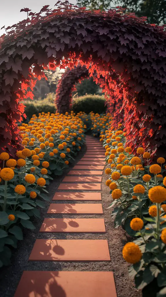
Warmth radiates from pathways designed with red, orange, and yellow tones, creating a psychological pull that draws visitors deeper into your garden spaces.
These hues evoke feelings of excitement and energy, making them perfect for areas where you’d like to encourage movement rather than contemplation.
Consider terracotta pavers bordered by coppery-leaved heuchera or accented with marigolds for an instantly welcoming approach.
In shaded areas, warm-toned mulch or golden gravel can brighten otherwise cool, dark pathways.
You’ll find that sunset colors work particularly well near entry points and in changeover zones.
For maximum impact, pair these warm elements with cooler surroundings—imagine a fiery brick pathway cutting through lush green foliage.
This temperature contrast heightens the visual drama and guarantees your pathway becomes a focal point rather than merely functional.
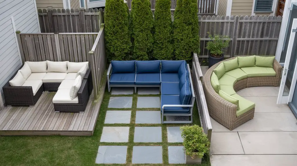
Incorporating garden walkways can also enhance the overall aesthetic and functionality of your outdoor space.
Incorporating Cool Colors for Serene Pathway Experience
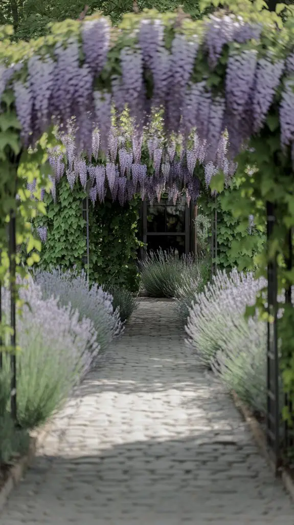
While warm colors energize and invite, cool hues on garden pathways create an entirely different psychological effect. Blues, purples, and greens slow the pace, encouraging contemplation and relaxation as you stroll through your garden.
You’ll find cool-colored bluestone or slate pavers particularly effective for meditation gardens or shaded retreats. Complement these materials with plantings of lavender, blue salvia, or purple verbena along the edges. For vertical interest, consider clematis or morning glories climbing nearby structures.
In dappled shade, cool-toned pathways appear to recede visually, creating an illusion of greater space in smaller gardens. They’re especially invigorating in hot climates, where they’ll provide visual relief from summer’s intensity. Adding charming water features like small fountains or ponds can enhance the tranquility of your serene pathway experience.
For year-round appeal, incorporate evergreens with blue-green foliage like juniper or blue spruce near your pathway.
Monochromatic Schemes for Elegant Garden Flows
Unlike more complex color combinations, monochromatic pathway schemes rely on variations within a single color family to create sophisticated, harmonious garden changes.
You’ll achieve this elegant aesthetic by selecting different shades, tints, and tones of your chosen hue for pathway materials, border plants, and accent features.
For maximum impact, incorporate textural contrasts within your single-color palette. Pair glossy-leaved hostas with matte-finished stones in varying blue-grays, or combine rust-colored gravel with copper-toned ornamental grasses.
Light plays a vital role—position your path to capture how morning and evening light transforms your monochromatic elements.
Consider depth progression by placing darker values of your chosen color in the background and lighter tones in the foreground to create visual momentum that draws visitors through your garden space. Additionally, using modern garden landscaping ideas can enhance the overall appeal of your monochromatic design.
Creating Seasonal Color Transitions in Path Design
As gardens transform through the seasonal cycle, your pathway design should anticipate and complement these natural color shifts rather than fighting against them.
Plan your borders with sequential blooming plants—spring bulbs giving way to summer perennials, followed by autumn foliage displays.
Incorporate permanent pathway elements in neutral tones that will highlight seasonal colors. Consider buff-colored gravel or light stone that reflects spring’s pastels, summer’s vibrant hues, and autumn’s warm tones.
You’ll maximize impact by clustering seasonal color blocks rather than scattering them randomly.
For year-round interest, integrate evergreens as anchors along changing points. They’ll provide structure during winter months when color is scarce.
Position deciduous shrubs with striking fall foliage at key viewing points, ensuring your pathways remain visually engaging regardless of season. Additionally, consider using colorful garden path ideas that feature diverse blooms to create a striking visual experience throughout the year.
Blending Hardscape Materials for Color Coherence
Hardscape elements form the backbone of garden pathways, extending the color narrative beyond plants alone. When selecting materials, you’ll want to contemplate how their hues complement your garden’s palette throughout the seasons.
- Choose stones that echo colors found in your home’s exterior for architectural harmony.
- Combine differently colored pavers in patterns that guide the eye through the landscape.
- Reflect on weathering effects—many materials deepen or fade with exposure to elements.
- Incorporate crushed glass, colored gravels, or stained concrete for intentional color pops.
- Test materials in different lighting conditions, as sunlight and shade dramatically alter perception.
- Consider adding affordable backyard fountain options to enhance the visual appeal of your garden pathways.
Border Plants as Color Frames for Your Pathways
Border plants serve as living frames that define your pathway’s edges, creating visual structure while introducing enchanting color progressions.
Select low-growing varieties like lavender, germander, or dwarf boxwood to maintain clean sightlines while providing consistent color anchors.
You’ll achieve greater impact by echoing your pathway’s color scheme in your border plants. Cool-toned paths benefit from blue salvias or purple verbena, while warm-toned walkways harmonize with golden creeping jenny or coral bells.
Consider seasonal color changes—plant spring bulbs, summer perennials, and fall grasses for year-round interest.
For striking focal points, periodically interrupt your borders with contrasting plant colors at key junctures. This creates rhythm and draws the eye forward, making your pathway journey more engaging and purposeful. Additionally, incorporating edible landscaping ideas can enhance both the aesthetics and functionality of your garden pathways.
Night-Friendly Color Choices for Evening Navigation
When designing garden pathways for evening enjoyment, color choices take on an essential safety dimension while still maintaining aesthetic appeal. You’ll want to select hues that remain visible as daylight fades, creating both beauty and functionality in your outdoor space.
- Silver and white flowers like moon flowers or dusty miller reflect even minimal light, acting as natural pathway markers.
- Pale yellows and light blues remain visible longer than deep reds or purples which fade to black.
- Variegated plants with light-colored edges create definition along path borders.
- Light-colored gravel or stone provides consistent visibility without additional lighting.
- Phosphorescent materials incorporated into stepping stones offer subtle illumination without harsh artificial light.
Incorporating decorative gravel styles into your pathways can enhance both their visual appeal and safety. Consider how moonlight interacts with your color palette to transform your garden into a navigable nighttime sanctuary.
Using Color Psychology to Direct Garden Movement
Color psychology plays a powerful role in guiding visitors through your garden spaces, subtly influencing both pace and direction of movement without obvious signage.
Deploy warm colors like red and orange to create focal points that draw visitors forward, while cooler blues and purples encourage lingering and contemplation.
Position vibrant yellows at decision points or junctions to naturally attract attention before pathway splits.
Use color intensity strategically—bright hues accelerate movement while muted tones decelerate it.
Create rhythm through color repetition, establishing a visual beat that pulls people along your intended route.
For a cohesive journey, shift colors gradually rather than abruptly changing schemes.
Remember that complementary colors (opposite on the color wheel) create dynamic tension and excitement, while analogous combinations promote harmony and smooth progression through garden rooms.
Balancing Bold and Neutral Elements Along Walkways
Striking a perfect balance between bold statement pieces and neutral elements forms the cornerstone of effective pathway design.
You’ll want to create visual rhythm that guides visitors through your garden space without overwhelming their senses.
- Pair vibrant flowers with neutral pathway materials like gray flagstone or tan gravel
- Limit bold color statements to 20-30% of your overall pathway design
- Use repetition of a signature color every 8-10 feet to create cohesion
- Incorporate white or silver foliage as connecting elements between bold color sections
- Consider seasonal color shifts when planning permanent pathway structures
- Including flower bed landscaping ideas can enhance the overall aesthetic around your pathways.
Remember that contrast creates interest while neutrals provide visual rest.
This balanced approach guarantees your garden pathways remain inviting year-round while still offering moments of excitement and discovery.
Conclusion
You’ve explored how color theory transforms ordinary garden pathways into immersive journeys. Research confirms that strategically placed colors can reduce garden navigation time by up to 15% while increasing visitor satisfaction. As you implement these principles, you’ll create not just walkways, but emotional experiences that guide, delight, and connect your outdoor spaces in a visually cohesive narrative that unfolds with every step.